Consider, we have deployed an infrastructure successfully using Terraform scripts.Now, you want to visualize your infrastructure and see the relation between resources created and how they are dependent on each other.
Lets explore different ways of achieving that..
Terraform Graph
This is the default option provided by the Terraform.The output generates a dot file.
dot - “hierarchical” or layered drawings of directed graphs. This is the default tool to use if edges have directionality.
We need to use the GraphViz to convert the dot file to a .svg to view it as an image.
Once you have GraphViz installed,we can directly generate the view using below command.
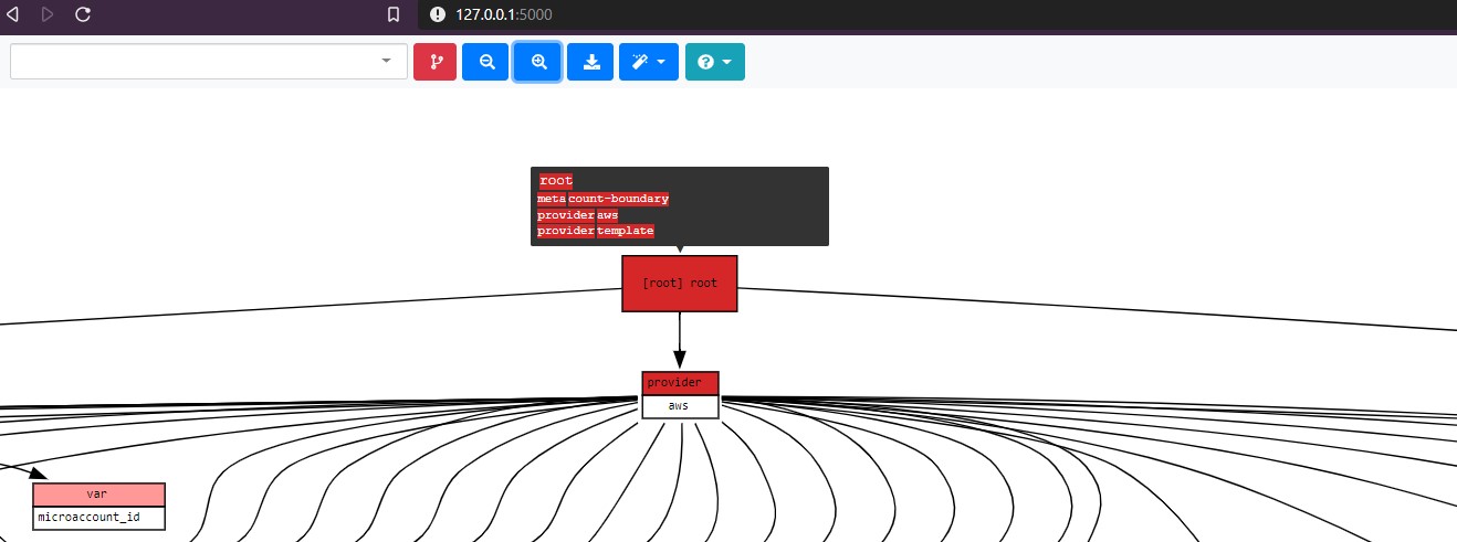
terraform graph | dot -Tsvg > graph.svgThe view inside the graph.svg would be as below.In my case with huge number of resources,multiple relations can be seen from the root node.

Cons: The graph representation becomes complicated and difficult to read once your infrastructure grows.
Blast radius
Blast radius is an open source tool,which comes to our rescue for solve the readability of the default Terraform graph output.
- It color codes the resources with the type.
- We can zoom in and out across the graph.
- Tooltips on all the resources.

- Filter the graph on a particular resources.

- It runs as a service and needs Flask library.
To use blast radius,using pip
- Install Flask.
- Install blast-radius
Run the command below to start the service.
python.exe blast-radius --serve <path to your Terraform directory>As you can see the same graph from Terraform is more readable with Blast radius.
Inframap
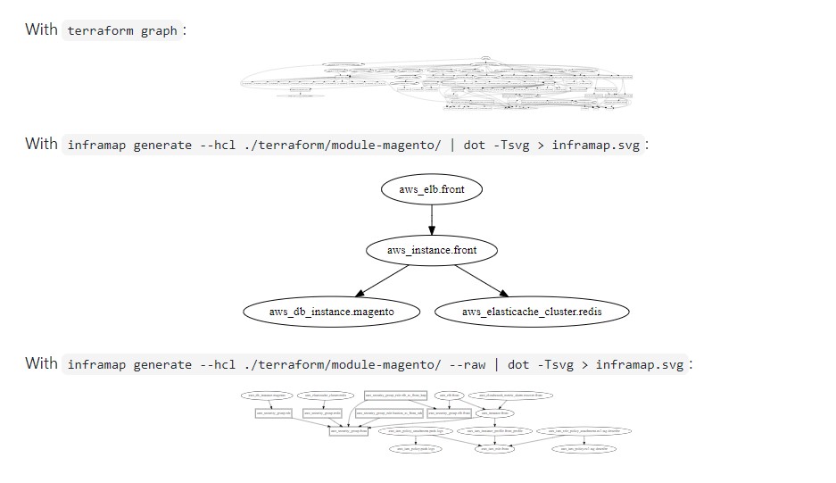
Inframap is the latest to tool for Terraform infrastructure visualization.Similar to Blast radius it allows to view the graphs per module or resource level.
A sample view from the Inframap is show below,taken from the project description.

Conclusion
So we have different ways to look into our infrastructure using the tools above.This helps in quickly finding and sharing the dependencies or track down a specific resource type.In my use,I have found best use with Blast Radius.