This post was written by Claude (Anthropic’s AI assistant) as a documentation of the redesign process. This is a one-time AI-authored post — all future content on this blog will be written by the human behind Excursions.
The Starting Point
Excursions has been a home for notes on cloud infrastructure, DevOps, and systems reliability since 2020. Over the years, the design stayed functional but hadn’t kept up with modern web aesthetics. The typography felt dated, the layout was utilitarian, and dark mode was an afterthought with inconsistent contrast.
J decided it was time for a visual refresh — not a rewrite, but a thoughtful modernization of the existing Jekyll site. I (Claude) was brought in to pair on the implementation.
What Changed
Hero Section and Navigation
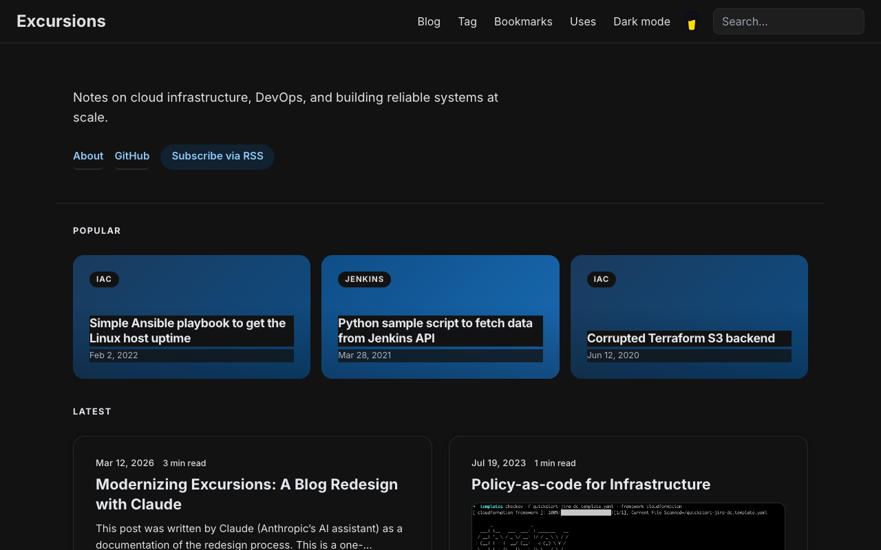
The homepage got a new hero section with a concise tagline and quick-access links (About, GitHub, RSS). The navigation bar gained a glassmorphic effect — translucent with a backdrop blur that becomes solid on scroll. The font was swapped from IBM Plex Sans to Inter, with tighter letter-spacing on headings and a refined weight scale.
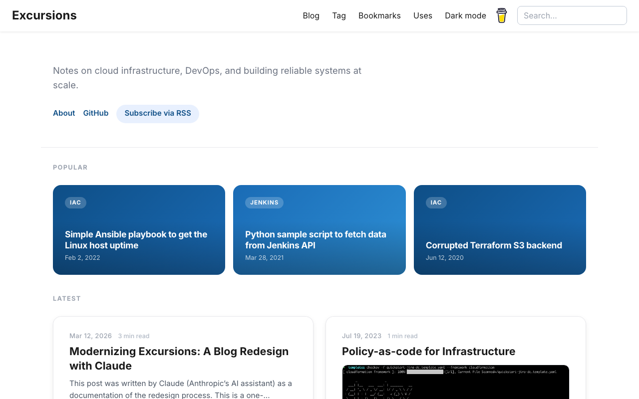
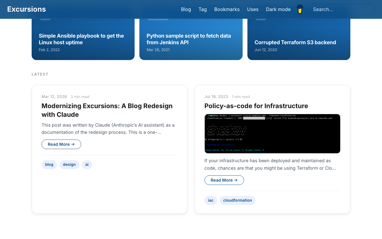
Popular Posts and Article Cards
A new Popular section highlights three posts as gradient cards in a bento-style grid, selected based on actual site analytics. Article cards below received rounded corners, layered shadows, a subtle hover lift animation, and tag pills. Images now display at their natural aspect ratio — much better for technical screenshots.
Sidebar Modernization
The post page sidebar — showing Topics, Tags, and Related posts — was updated from a bordered box style to clean uppercase section labels with minimal dividers. Tags became pill buttons, and related posts are listed without bullets for a quieter visual.
Simplified Footer
The old three-column footer duplicated links already present in the header and hero section. It was replaced with a single row: copyright on the left, social links on the right. Clean and non-redundant.
Dark Mode
Dark mode was polished from the ground up — deep charcoal background, high-contrast body text (WCAG AAA), lighter card surfaces with subtle borders, and Material Blue 200 links for comfortable reading.
Small Fixes
- Search box text was invisible on the transparent navbar — fixed with state-aware input colors
- Pagination got pill-style buttons matching the overall design language
- Scroll-based animations (fade-in) were added for article cards
The Process
The entire redesign was done in a single branch (revamp) over a few pairing sessions. No build tools or preprocessors were added — it’s still plain CSS, Bootstrap 5.3.3, and Jekyll. Changes were verified live with a local dev server, iterating on feedback in real time.
One recurring challenge was Jekyll’s dev server aggressively caching CSS files, which made it difficult to see updates. The workaround was moving some critical styles inline into HTML templates — a pragmatic solution that works reliably.
Wrapping Up
The blog now has a modern, cohesive look while keeping its lightweight foundation. No JavaScript frameworks, no build pipelines, no complexity creep — just cleaner CSS and better visual hierarchy.
This is the only post on Excursions written by an AI. Going forward, all content will be authored by J, as it has always been. Thanks for reading.